CLOSE
My Role: UI/UX DESIGNER
Project details: Mobile application design, DesignLab case study, 2021

CONTENT: This was a student project in UX Academy at DesignLab. Lib+ is an mobile application to boost individuals working from home experience by improving productivity and reduce distraction, as well as encouraging users to expand their network. COVID-19 has forced a large portion of the global workforce to work from home, in which many are in fact struggling in many ways while working from home especially those who live alone.
PROBLEM: Lib+ started with an initial idea of helping individuals working from home alone. The common challenges of remote working were loneliness, while collaboration and distractions at home. Individuals who work from home need to balance work and life well, because they would like to work more efficiently and finish work done on time so that they can enjoy their life.
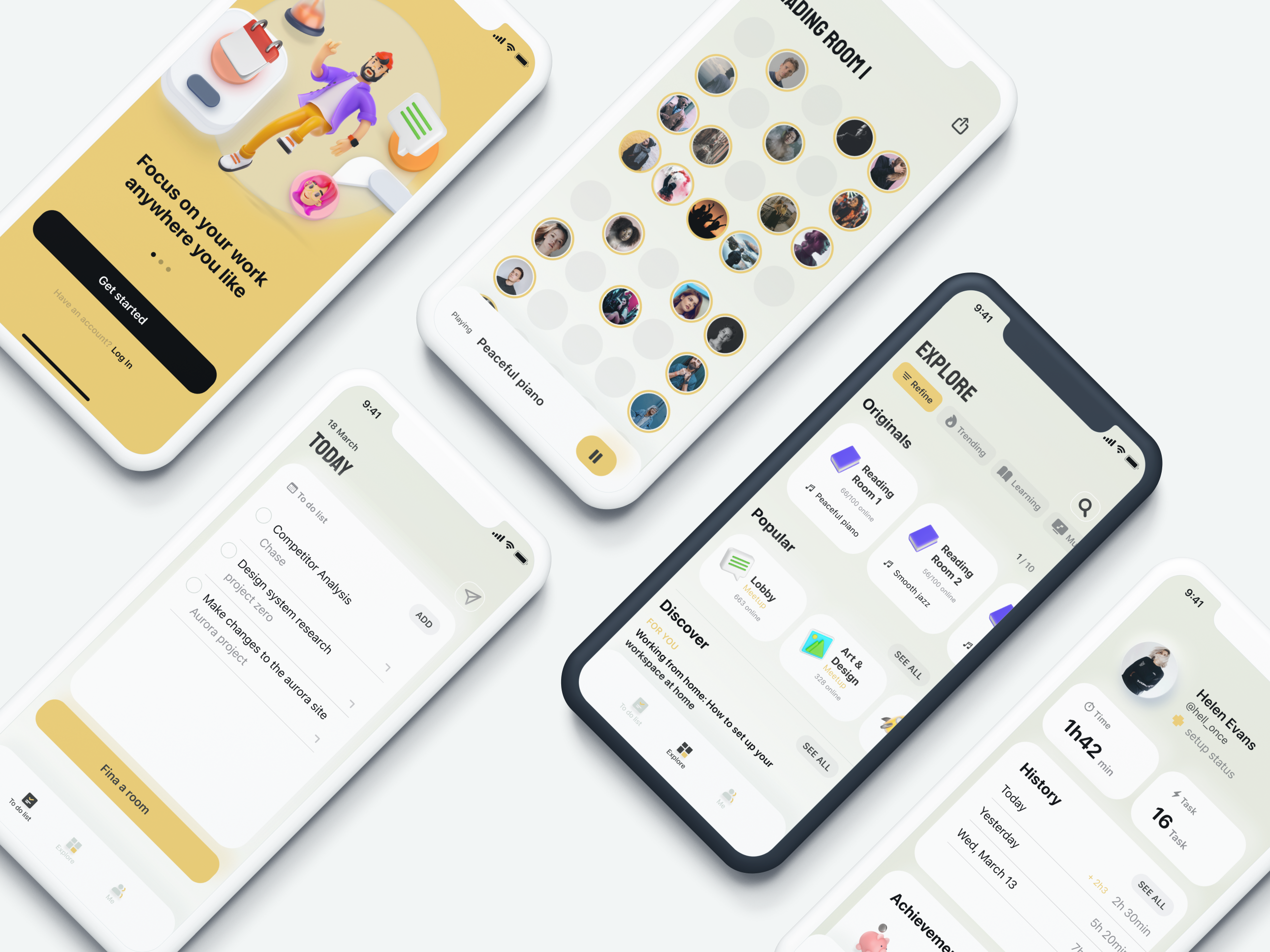
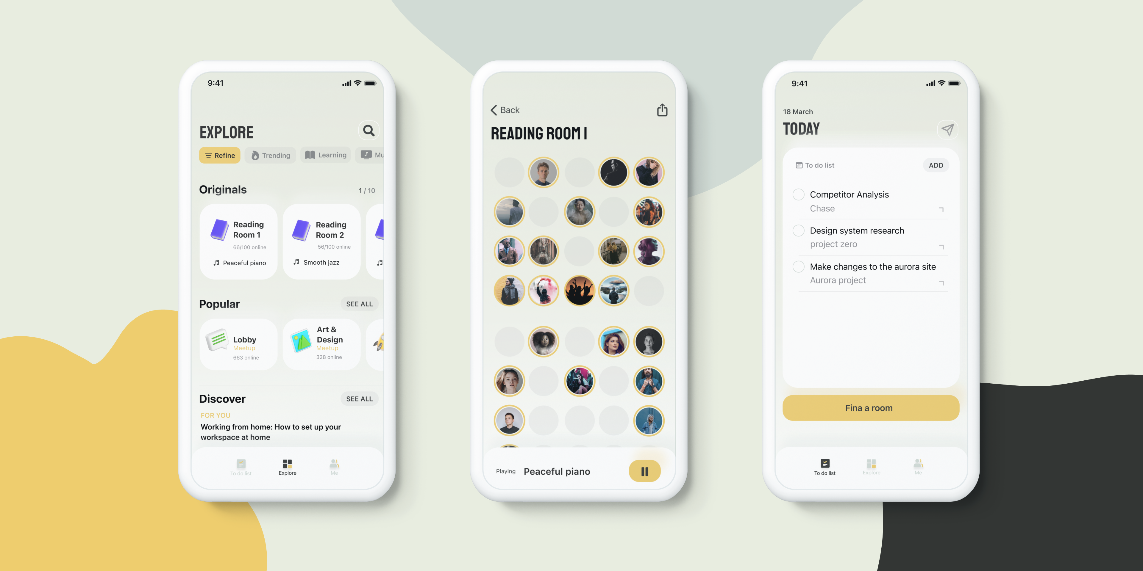
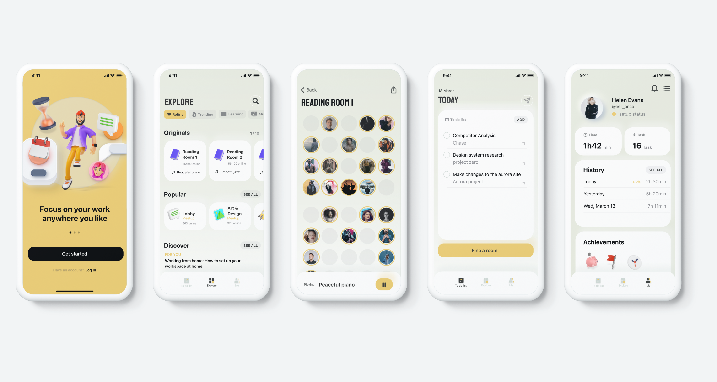
OUTCOME: An end to end mobile application design exhibiting all the available online working spaces. The users can choose to focus on their own work or potentially meet other people working towards same goals online.
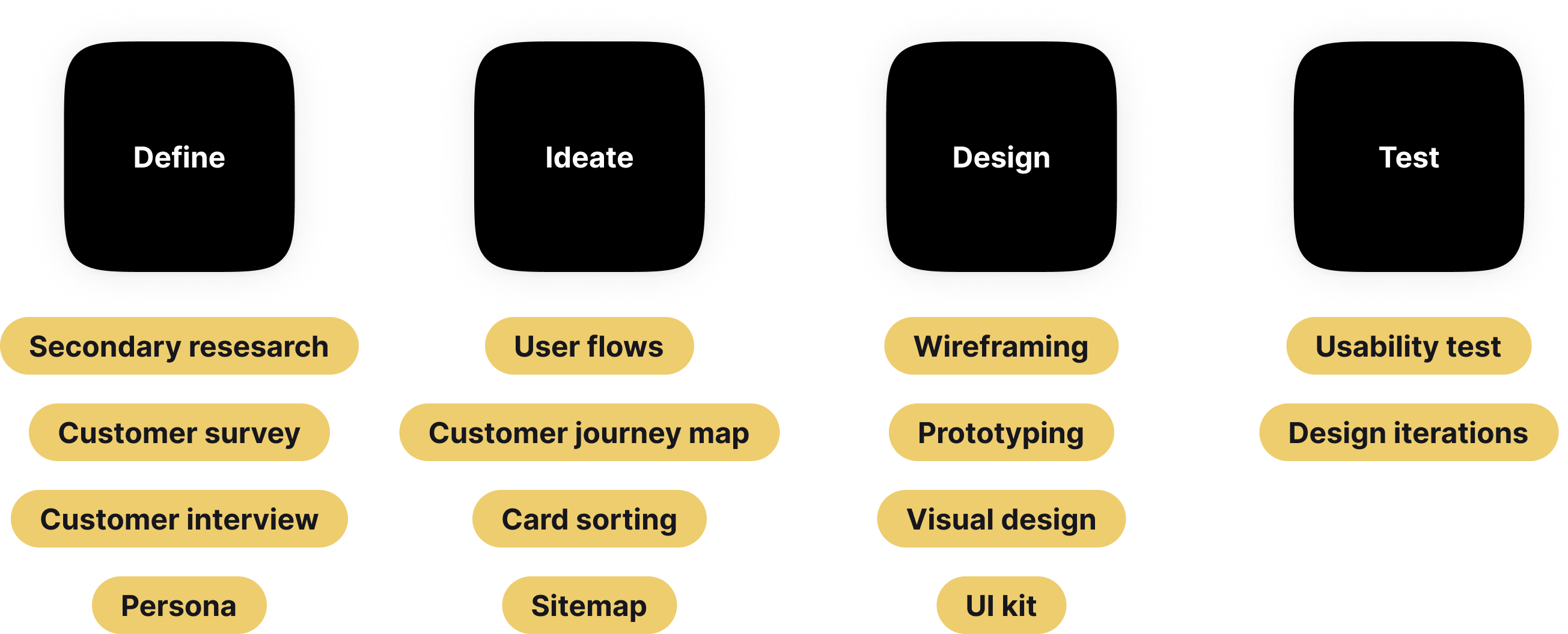
As I have personal experience of working from home alone, this project has been my vision and helped me to understand and empathise with users more. I started the project with secondary research on current condition of working from home, and direct competitors on the market to help and simplify remote work. Many studies have pointed that the remote challenges including time management, working collaborations and lack of human iterations. The majority of work from home app existing on the market either involves working collaboration or staying focused.
The research was focus on the following aspects; I created a research plan to guide me through the process.
Customer survey: obtain the insights of user behaviour and general opinion and concerns towards working from home alone. Even though small quantity of results were collected, this survey have helped to better structure and lead the user interview.
Customer interview: understand users needs, past experiences and expectations of working from home alone. The user interview focused on the enjoyment of working from home, and how they work collaboratively. The study helped understanding users daily work routine and problems encountered during the process. The participants were aged from 20 to 30 who are experiencing working from home alone.
Key insight:
(click here for more research findings)
I envisioned a primary persona basing on all our data and empathy research to understand and capture the behaviour patterns, goals, attitude and background information. These personas reflect real user patterns and context.

Mission: create an engaging online platform to improve individuals' WFH experience and encourage networking with a sense of warm and friendliness
Vision: empower people to work and network better at home
Values: Community and teamwork, diversity and inclusion
In order to determine the full feature list of the product along with prioritisation, project goals documents including both business goals and users goals was created.
Problem statement: How might we encourage individuals who work from home alone build a more regular routine and feeling less isolated?
Individuals who work from home alone need to balance work and life well, because they would like to work more efficiently and finish work done on time so that they can enjoy their life. Meanwhile they would like to access more opportunities and be able to connect with other people at home. A user flow was generated basing on path predication by the prototypical persona on the mobile app to complete the working task.
A customer journey map was created to visually illustrate the flows throughout the process and helped to identify key interactions and touch points and reflect customers feelings and thinkings.
To improve productivity and reduce distractions:
To combat loneliness:
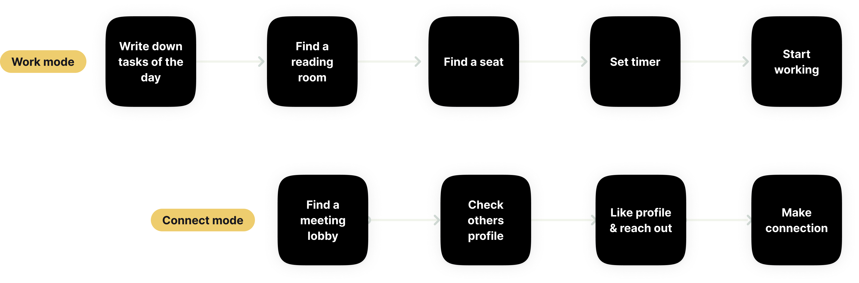
I validated my design having a usability test with a low-fidelity wireframe prototype to test the effectiveness, error tolerance and ease to learn. The users were asked to perform tasks with 2 pre-defined scenarios; to find a reading room online to start working for 30mins, and find a person to check this person's profile.
Priority revision:
Click here to view the updated wireframes
Lib+ wants to present with a sense of friendliness and warmth, as well as simplicity and sophistication.
Final design
When I first designed Lib+, I followed a fairly structured UX process, research, synthesis, ideation, testing, iteration. At the time, it was a valuable way to build fluency and confidence in my design practice. But looking back, I can now see how easy it is for portfolio projects to start feeling like a cookie cutter factory, even when the intent behind them is thoughtful.
In hindsight, what made this project meaningful wasn’t the process steps. It was the moment I began thinking about design not just as solving tasks, but shaping behaviour and emotion. If I were to approach this project today, I would:
