CLOSE
My Role: UI/UX DESIGNER, VISUAL DESIGNER
Project details: Website design, DesignLab case study, 2020
CONTEXT: This was a student project in UX Academy at DesignLab. Cubana de Aviación S.A, commonly known as Air Cubana, is a state-run airline of Cuba as well as the country's largest airline found in 1929, becoming one of the earliest airlines to emerge in Latin America. Air Cubana sees an opportunity opening up a flying experience that’s a cut above the usual. They plan on updating existing airline in 12-18 months and are looking for a streamlined, well-thought-out user experience to match.
PROBLEM: The Air Cubana's website is currently out of date and unoptimised to serve the purpose of airline booking with poor user experience and not mobile friendly.
OUTCOME: A Responsive website that improve users booking experience with a refreshed brand image.
The initial phase of the project is to understand the current services and to explore the features and functionality, and identify current problems during flight booking process. I proposed a research plan with both quantitative and qualitative research methods. I started the project with a quick usability test to uncover pain points in the booking process and secondary research by discovering the airline industry and competitor analysis with heuristic evaluation. The usability test showed the webpage has failed to serve the purpose of booking flights as I was unable to book any flights or access to the English site. The webpage itself was outdated and not mobile friendly with some unresponsive buttons.
Competitor analysis : direct competitors were defined as various state run airlines, including booking procedures, flexibility and information display. Majority of the website displayed similar design patterns with consistent UI, clean and clear layout, but some of the common problems were responsiveness of the webpage, confusing searching results and lack of error tolerance.
User research were conducted with the help of a research guide.
Customer survey: by performing the online survey, quantitate information about the user behaviours, the attitude regarding the bookings flights were gathered. Even though small samples of results were collected for the online survey due to tight timeframe and budget, but this survey have helped to better structure and build the customer interview.
Customer interview: by conducting a semi-structured interview, I have obtained basic information about participants travel reasonings, goals, past experiences and expectations. All the participants were aged between 20 to 50, who have previous experience on booking flights on official airline website.
Key insights:
As the results of the prior research, I envisioned a persona to understand and capture the behaviour patterns, goals, attitude and background information to help guide resasonings behind certain design choices. Jake is a frequent flyers who travel regularly need to book flights from airlines' official website because they would like to become airline alliance members, get access to exclusive offers, and make changes to the flights easily with more flexibility.
Key insights:
Problem statement: How might we present the users with simplifed booking process and direct solutions?
A user flow was generated basing on path predication by the prototypical persona on the flight booking process.
A sitemap was created to help structure the information architecture of the webpage.

Frequent flyers who travel regularly need to book flights from airlines' official website because they would like to become airline alliance members, get access to exclusive offers, and make changes to the flights easily with more flexibility. A product feature roadmap based on the user research conclusions, the business’ needs, persona was created by prioritising the features on the list based on their importance to both business and users.
I remain the original logo design with comparatively more vibrant colour choices to present the brand with fresh, modern and sophisticated look. The style tile below showed collection of visual elements and its implications.
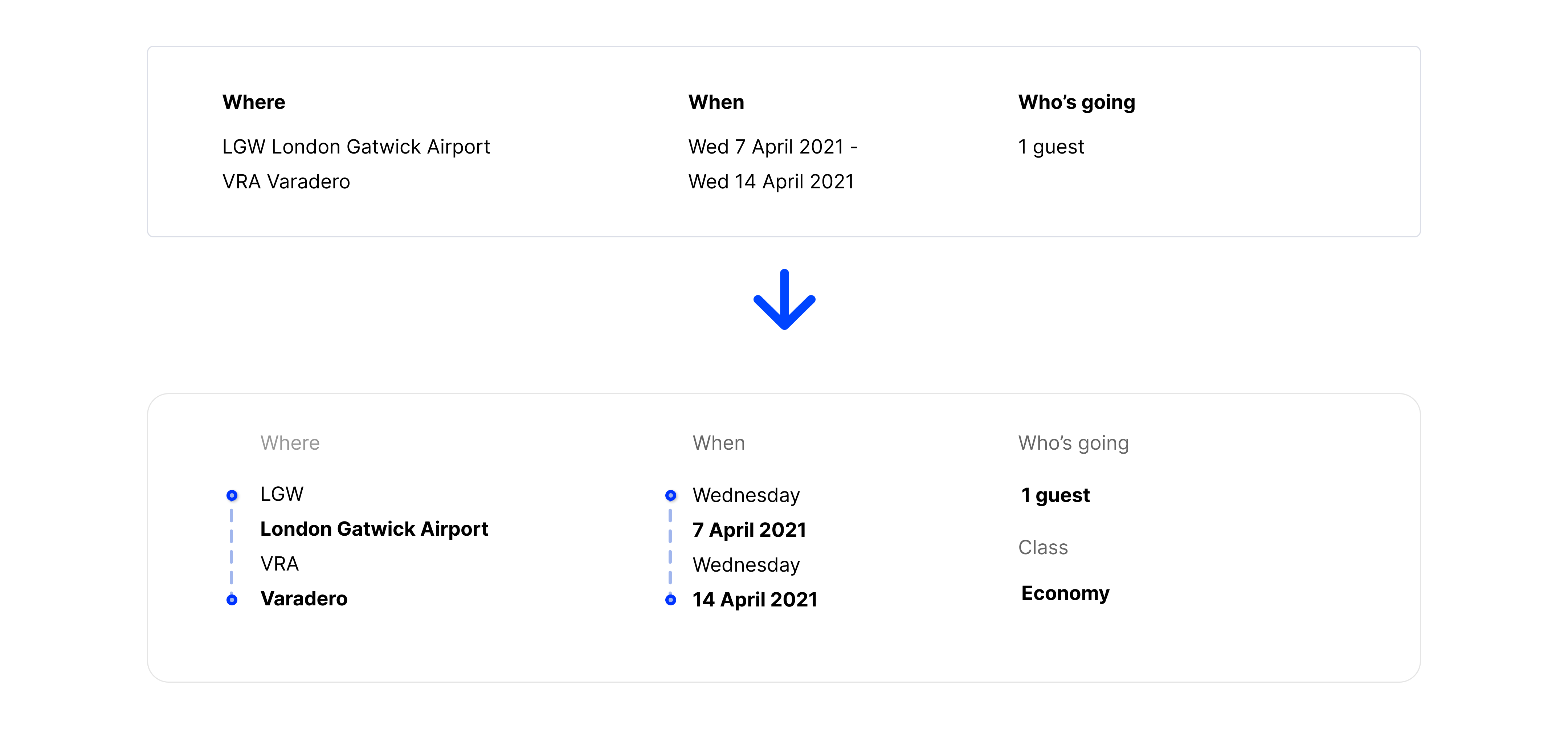
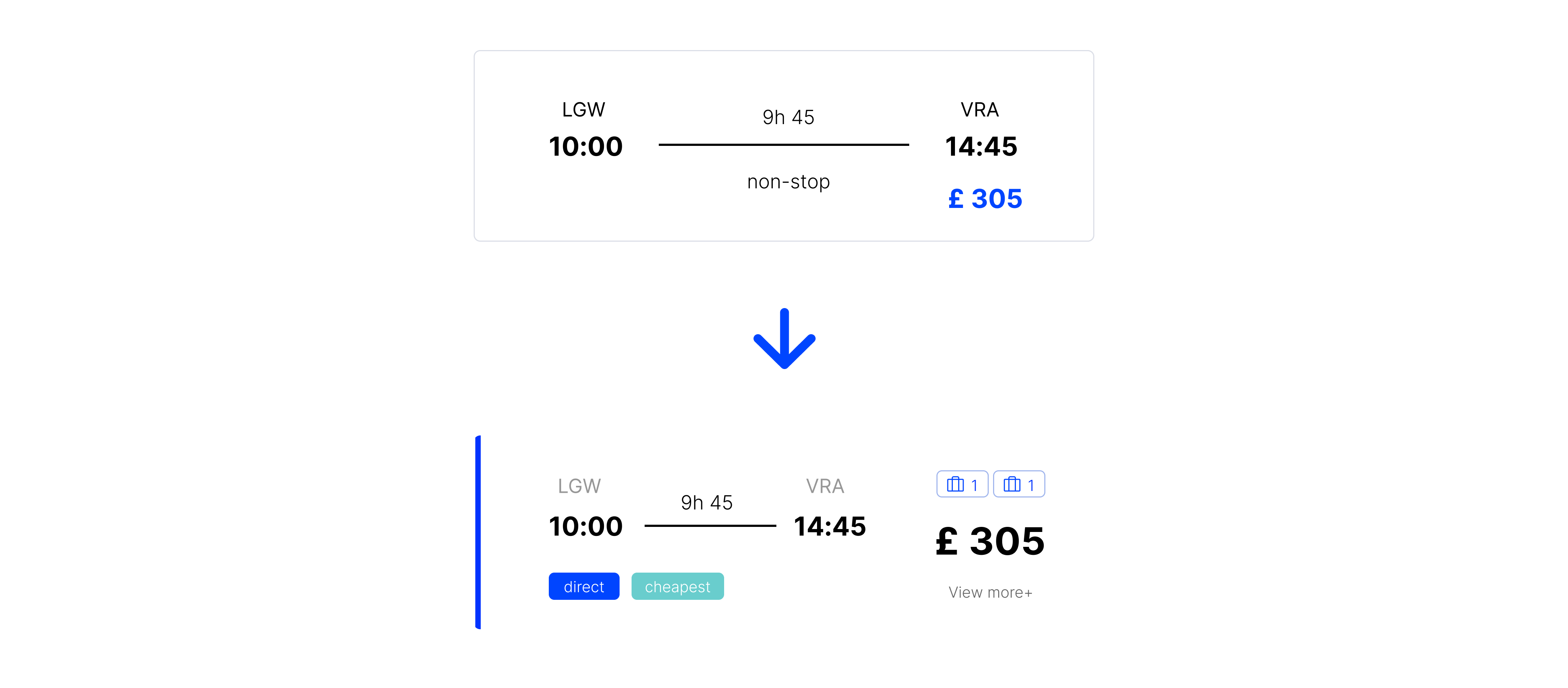
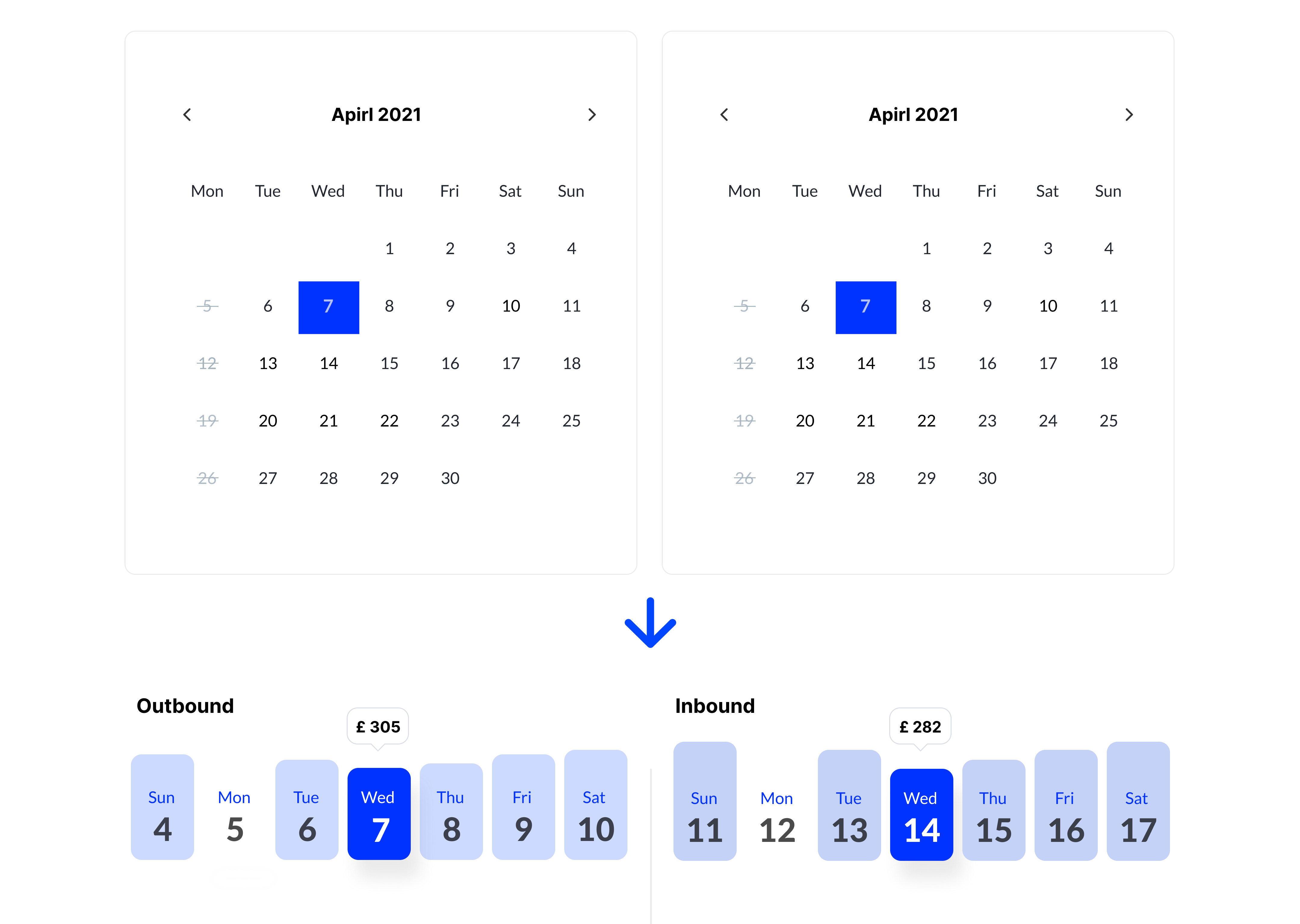
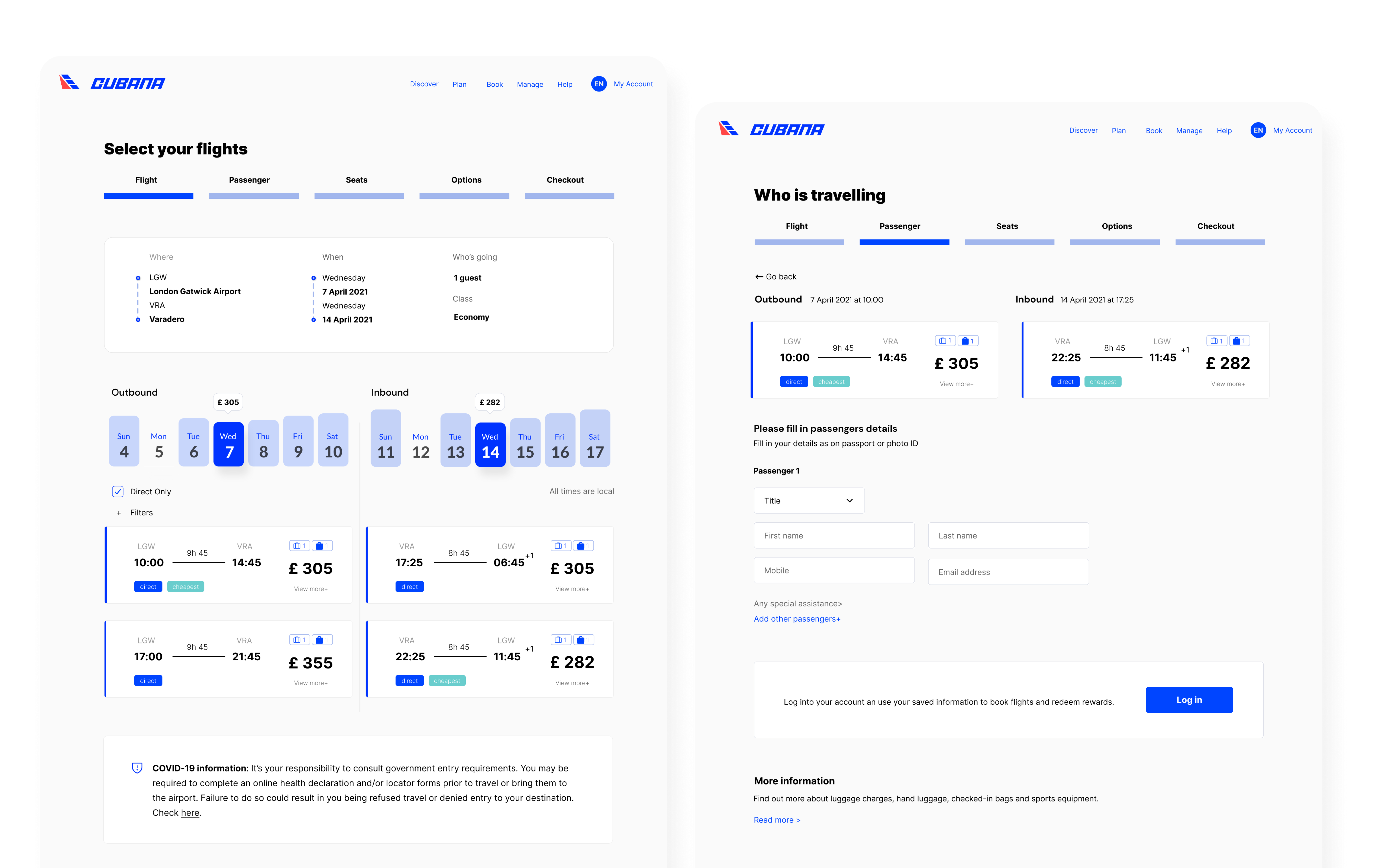
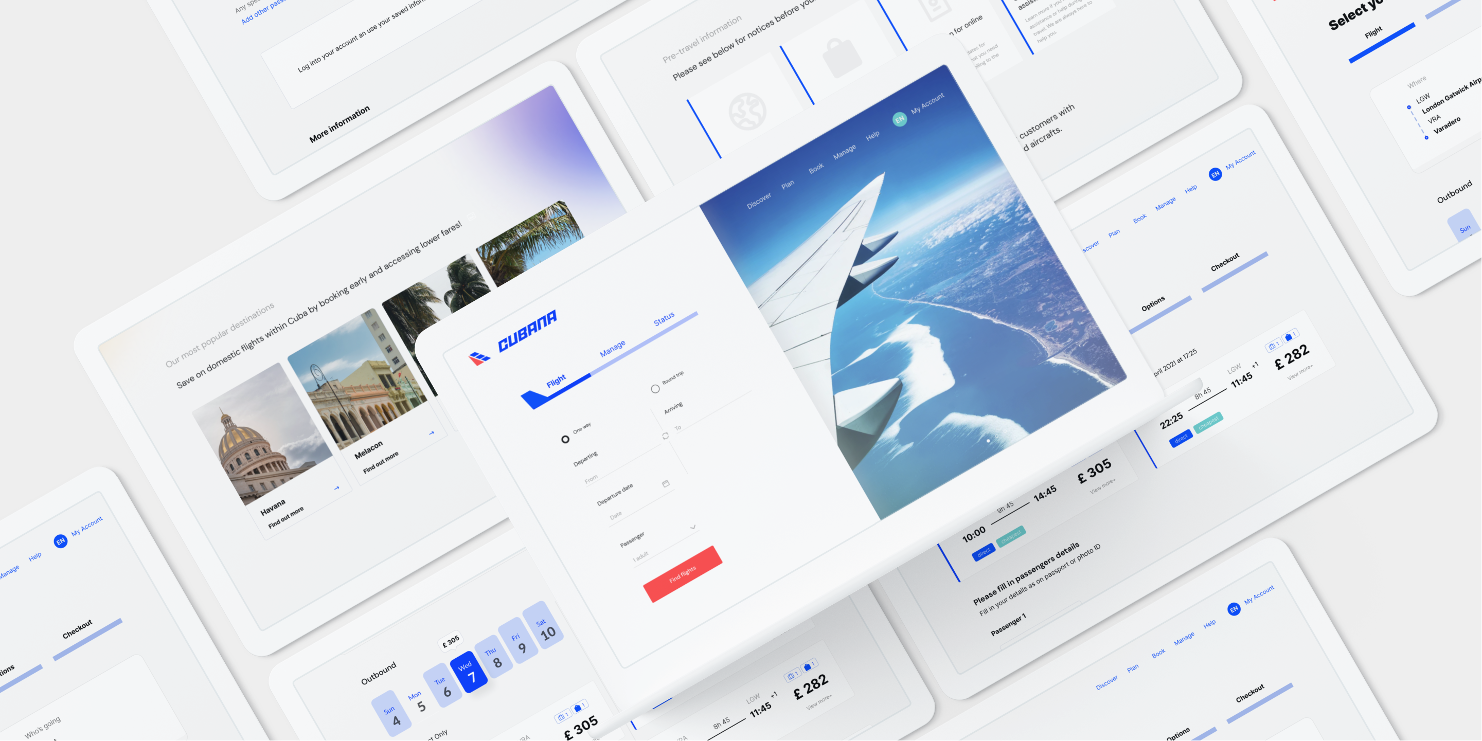
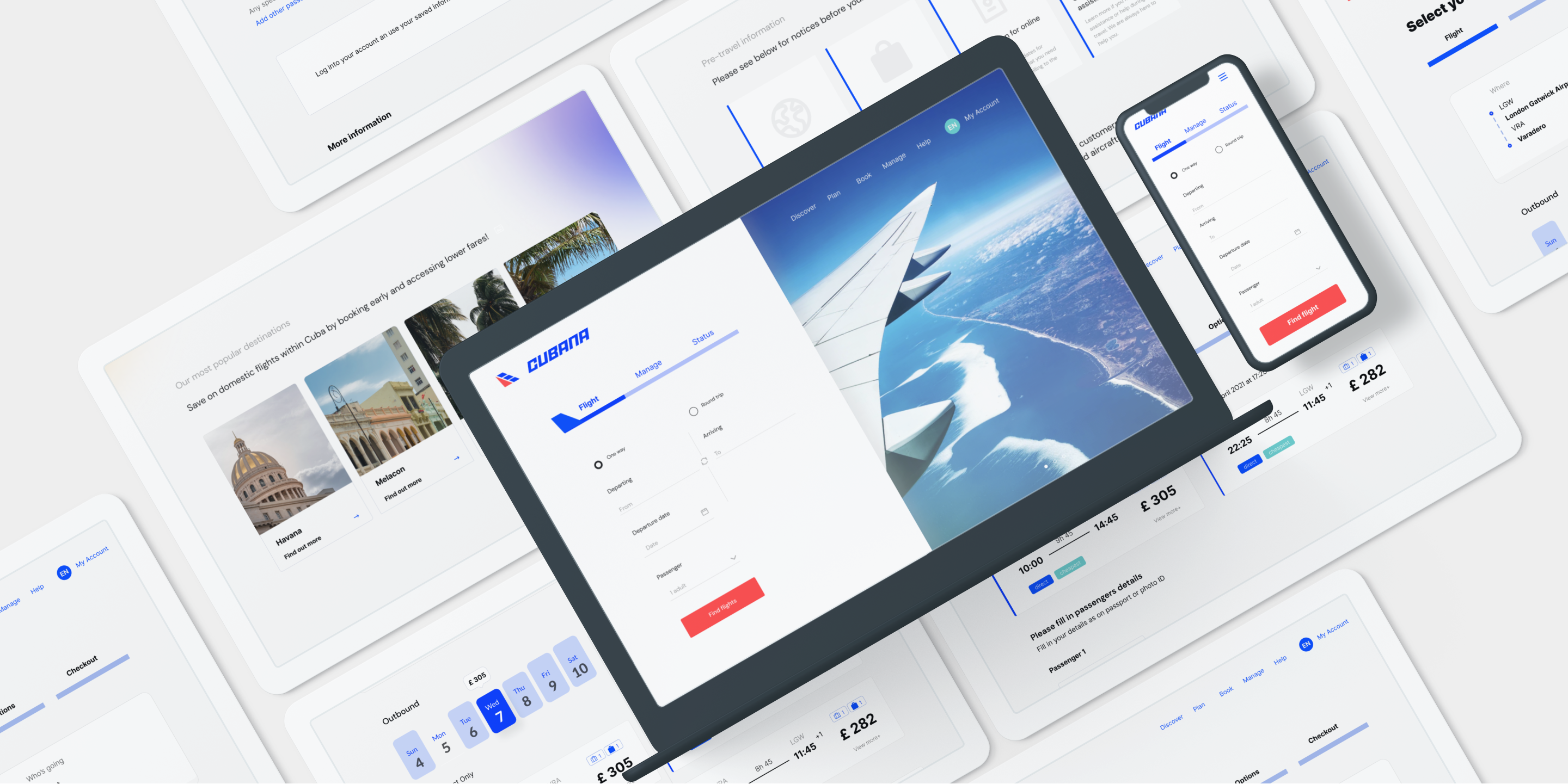
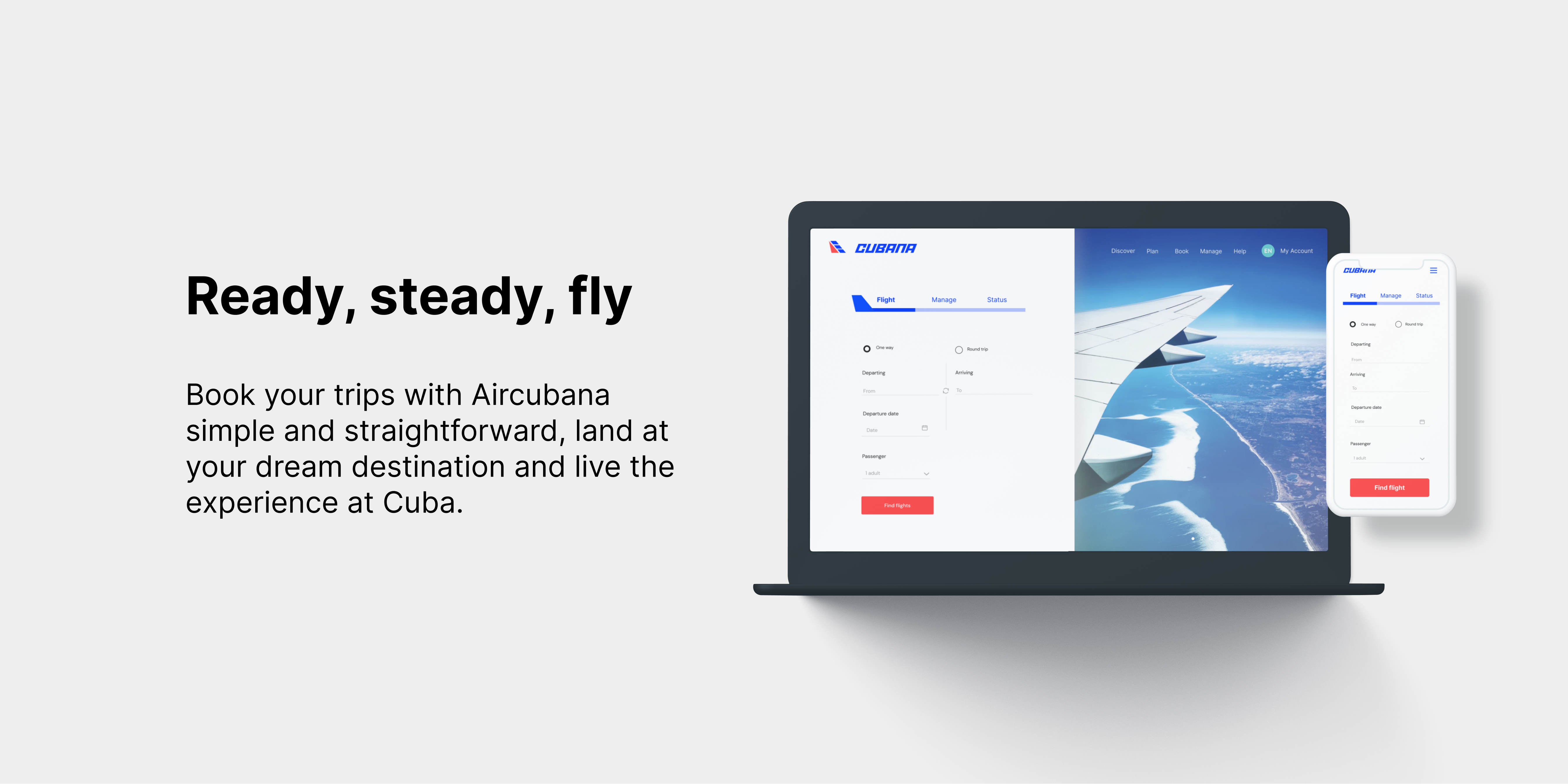
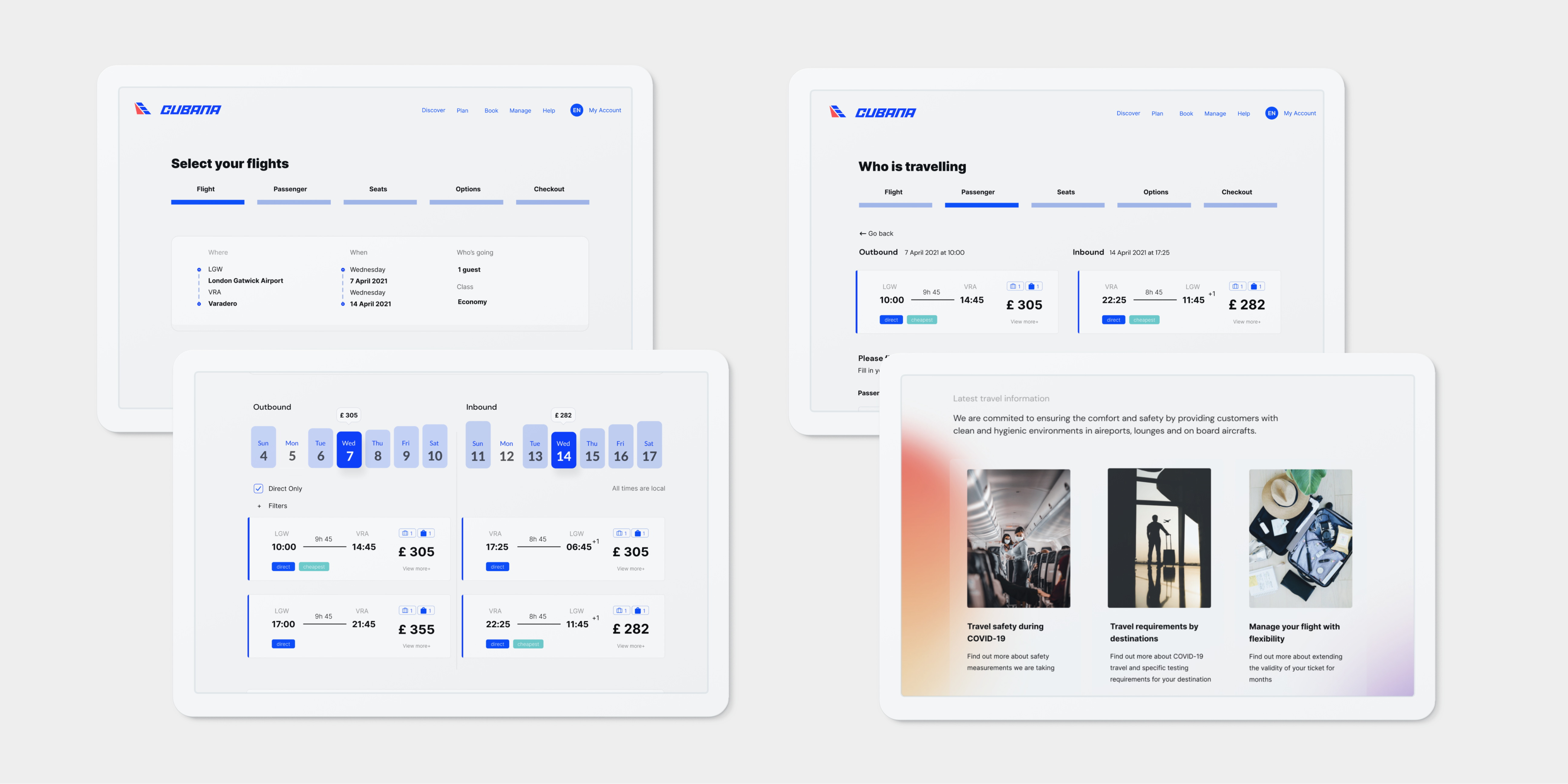
The objective of the project is to design the responsive design to serve the purpose of booking flight easily and conveniently.
Low-fidelity wireframes were made in Figma for user testing on the layout and overall flow of the design.

I validated my design by running a remote usability test with play prototype on Figma. The users were asked to perform tasks with a pre-defined scenario; to book the cheapest returned flight from specific departure and destinations with a given time frame. All of the users were able to complete the tasks as intended, and some of the feedback was gathered and grouped.
Priority revision: